

This was a Figma-based assignment requiring us to find an e-commerce website that could be improved, then analyze the problems and find ways to solve them through redesigning the company's website. It was my first time designing a website, and we learned that it was important to get to know the user and their expectations of the site so that people can intuitively navigate through the site easily, so I conducted an interview with my friend who often uses these types of websites to buy stationery to better understand what a customer would want to see and what features they would like to have to make more convenient purchases.
According to their website, PaperPlusCloth is a: “stationery store carrying unique paper goods and art supplies from Japan, Taiwan, Malaysia, Korea, US, Germany and Canada. Specializing in Japanese, Taiwanese, Malaysian and Korean stationery supplies and products in the heart of Parkdale, Toronto on West Queen St West. We are a community space offering workshops and meetups on various creative topics.”
Skip to Final Product


Based on the answers and feedback from my friends, I created a persona called Queenie, who writes to her numerous pen pals everyday using a variety of stationery products. She also gifts her pen pals and friends stationery often and loves browsing on different stationery store websites for the latest products to add to her collection. Most of the time she decorates her letters with a specific theme so she occasionally needs to buy stationery that fit the particular theme she’s attempting to do, (e.g. food/animals/characters), or wants specific colours. She lives in the city, but does not have much options in terms of physical stationery shops nearby her, so she often turns to online options.
After some consideration, I determined some keywords that I wanted the design to convey, combining the feeling of the original website and what I felt when I visited their physical store:
Clean/Calm/Simplistic/Warm/Inviting
I then started working on the visual aspects of the design, starting with a moodboard, choosing styles, colours and typefaces. I tried to pay attention to how my design choices would affect the user and how they could help make navigating the website a pleasant experience.
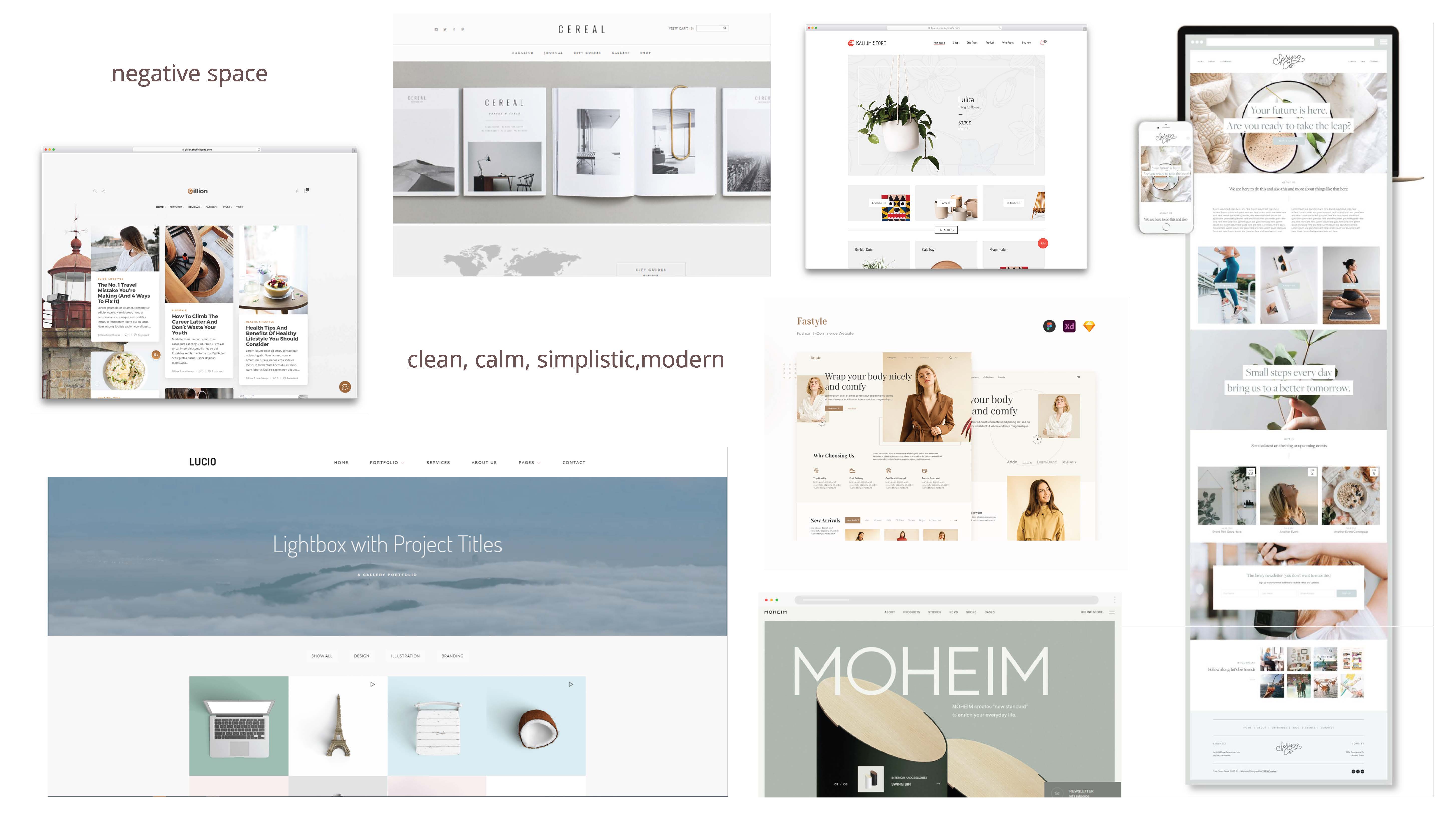


To achieve a calm feeling, I chose to keep using only neutral colours, but I also chose warmer tones for a nice cozy feel. I then made sure to check the colour contrast of my colour pairings with an accessibility checker to make sure they were readable. I organized everything with a grid, and kept graphic elements to a minimum to maintain a clean layout. For typefaces, I chose a more readable sans serif typeface for headings instead of the original cursive to keep the classy feel but still maintaining legibility, while also pairing it with an elegant serif typeface with high readability for body copy.


We were instructed to design four pages in total, a homepage, a category page, a single item page and a shopping cart page. I drew wireframes for each page to plan the layout, and set to work in Figma to bring the design to life.


